There are many, many, many, many web sites, tutorials, how-tos and printed pages written on how to create a website; the proper steps needed, the best way to design, the best place for hosting, and on and on. Well, here’s another one…
Hopefully this reaches a different audience and provides insight and help along the way.
Additionally, this post is part of the dissertation. Of the How, What and Why of the website, this post explains the How. So this post is less a how to do it for you, but an explanation of what I did, as part of the methodological approach to digital humanities section of the dissertation.
Content is King
The absolute most important thing for a website to be relevant and useful is to have pertinent and quality content. Many ugly and difficult to use sites exist and are frequently used because they have important and relevant content. A simple web search turns up hundreds of articles addressing the need to put content first. Links to such articles are almost pointless in that new articles are written constantly. Nevertheless, here is a great article stressing that generally the most important step is to define the content, then create the HTML structure, and then finally design the website. By “content” what is really meant is what kind of content types are used in the website, not finished and edited prose, images or video. “Content” means structure, as argued by Mark Boulton. In reality, “content” influences design, and design influences content, but in general, it is important to know what types of content are to be used on the site first. Below I describe four content types used in the dissertation website.
The basic purpose of a website is not to support the needs of the creator, but to answer the users question. A user comes to a website looking for information or an answer to a problem or question. If that answer is not found, they will go looking elsewhere.
With that thought in mind, I looked at all of the information and content that I have and tried to figure out what the website visitors would most want. The purpose of the site is to be a repository of documents and information about the underground dispersal projects, so that information and those documents are the most important pieces of content.
The site also contains essays (discourses/chapters/treatise/monograph/disquisition/paper, whatever they be called) about German and English morale during the bombing wars, the interaction of German businesses with the Nazi government, the reason why some businesses were moved underground in the first place, a discussion about the merits of a digital dissertation over a traditional written narrative dissertation, a summary and analysis of the underground project at Porta Westfalica, and an analysis of a digital project that maps the location of events for numerous inmates at Porta Westfalica.
Another piece of content on the site are the teaching modules. These modules will help high school and undergraduate German language teachers utilize the primary sources in the repository.
Finally, the repository itself and the documents within are desirable as content.
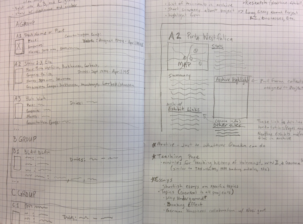
Through this exercise I formalized that I have four distinct types of content for the site: project information, primary documents, teaching modules, and informative and analytical disquisitions/chapters/essays.
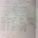
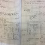
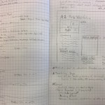
Below is an image of my notebook brainstorming the content, structure and design of the website.
Audience
Another key factor in designing the website emerged simultaneously with the four content types; the desired content depends on who is visiting the site.
For an example, if I were a high school German teacher looking for a way to get my disinterested kids more interested in learning German instead of throwing spit wads at the ceiling during class, then what I want when I come to the site is a ready made plan for grabbing their attention by appealing to their weird fascination with all things Third Reich (which, honestly, is probably why they are taking German in the first place). If I see a link to teaching modules, I’m sure to click it. If I see some examples of those modules I’ll be even more likely to click through.
As another example, if I am a scholar and I’m looking for documents about underground dispersal projects or letters written by Hans Kammler, then having a link to the repository makes it easy to find what I need. Again, an example of documents displayed on the page is more helpful than a link, and a search box for searching the repository directly is the most helpful of all.
Semantic Structure
Much has changed in the past few years of web development, especially with the adoption of the HTML 5 and CSS3 standards. There are now HTML tags specifically for writing, like: article, aside, figure, and figcaption. When taken seriously, HTML semantics provides for a much better web experience (especially for those using alternatives to web browsers like screen readers for the deaf) by providing a well built structure to frame the content and a scaffold upon which can hang a beautiful design. The above linked Smashing Magazine article does a great job pointing out the desirability of properly structured content.
One can think of the HTML structure of a webpage in the same way one uses an outline of an essay. The structure defines where the content goes. A great resource for understanding the HTML5 structure and elements is found at the Mozilla Developer Network site.
Fortunately, many modern content management systems take care of (or obfuscate) the underlying structure. I will try to influence the underlying HTML that WordPress and Omeka create, but as this is a historical dissertation and not a work about web standards, the end result will be something less than perfect semantic markup.
Design Matters
The way a website looks matters. Designs can make it easy or difficult to find the content. Sometimes design elements get in the way and distract from the content. There are many sites and articles dedicated to teaching you how to design a website. Companies have been formed with the goal of instructing you how to build and design websites. One favorite instruction site has been tutsplus.com which has instructions for almost anything computer related. A great online magazine that deals with modern designs in websites is the before linked Smashing Magazine. There are many, many others.
Wireframes
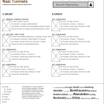
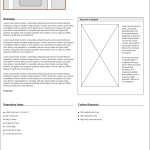
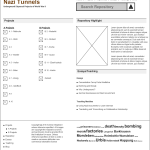
Any easy way to get a sense of how the different components and content types fit together is to create a wireframe. A wireframe is a very rough sketch of the website just to show how the components fit together. They may or may not include actual pieces of content. Often they contain filler text and filler images. As the name implies, wireframes are a barebones outline of how the website components fit together, much as a sketch for an artist precedes the painting.
There are many software options available for creating wireframes, each with advantages and learning curves. As a matter of practice, I used the online tool, MockFlow. The easiest method for creating wireframes is using good old paper and pencil.
I used paper and pencil or the very rough sketching, and MockFlow for a bit finer detail and included some actual content.
Navigation
Getting around the site is crucial. If a website is like a maze and clicking on links leads to loss of bearings and confusion, visitors are less likely to continue using your site and may not come back.
This site design has navigation at the top of the page that will remain in place no matter what page is being visited. Main navigation links are also found at the bottom of the page in the footer. These menu items link to the four content types; projects, repository, teaching, and essays, with links to the home page and blog/news section as well.
One goal for this site is to have all desired content available within three mouse clicks. That is, no matter what page I am currently viewing on the website, I should only have to click on at least three links to get the content that I want. The top and bottom navigation menu makes it possible to get to the four main content pages with one click. A second click brings me to an individual project page, a specific disquisition (essay), or a lesson plan. Similarly, using the search tool allows me to view a list of repository items in one click, and view the item (if the item is on the first page of results) on the second click.

